Back to work
//Design System

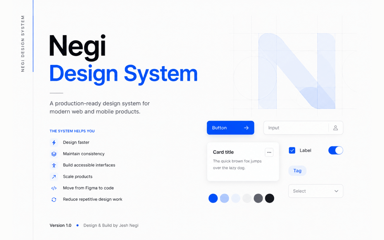
Design System

Building a scalable foundation for digital products

A structured design system — foundations, tokens and a scalable architecture — built to remove repeated decisions and keep future product work consistent by default.

Role

Product & Design Systems

Year

2025

Platform

Web & Mobile

Design SystemsUI ArchitectureFigma
Design System
01

Why I Built It

As products grow, small inconsistencies in colour, type, spacing and interaction patterns compound — every new screen makes a fresh decision that a previous screen already made differently. I built this system to remove that repetition: a structured foundation a product can be designed from, rather than decided fresh each time.

02

My Role & Constraints

An independent project — design and build, solo, foundations through tokens, plus the documentation that makes the system usable by someone other than me. The constraint was sequencing, not scope: building components before the token layer existed would mean rebuilding them the moment the tokens changed underneath — so foundations came first, deliberately, even though components are the more visible payoff.

03

System Architecture

The system is built in layers, each one only making sense once the layer beneath it is solid — foundations first, then the tokens built on them, then components, then patterns.

01FoundationsBuilt
ColourTypographySpacing
02TokensBuilt
Primitive scalesSemantic roles
03ComponentsNext
ButtonsInputsCards
04PatternsNext
FormsDashboardsEmpty states
04

Foundations — Colour

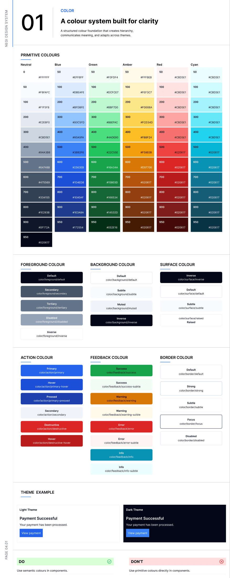
Six primitive colour families sit underneath a semantic layer — foreground, background, surface, action, feedback and border — so a component never references a raw hex value directly.

Primitive colours

Neutral

0
100
300
500
700
900

Blue

50
200
400
600
800
950

Green

50
200
400
600
800
950

Semantic tokens

Foreground

Defaultcolor/foreground/default
Secondarycolor/foreground/secondary
Tertiarycolor/foreground/tertiary
Disabledcolor/foreground/disabled
Inversecolor/foreground/inverse

Background

Defaultcolor/background/default
Subtlecolor/background/subtle
Mutedcolor/background/muted
Inversecolor/background/inverse

Surface

Defaultcolor/surface/default
Subtlecolor/surface/subtle
Raisedcolor/surface/raised
Inversecolor/surface/inverse

Action

Primarycolor/action/primary
Primary hovercolor/action/primary-hover
Primary pressedcolor/action/primary-pressed
Secondarycolor/action/secondary
Destructivecolor/action/destructive
Destructive hovercolor/action/destructive-hover

Feedback

Successcolor/feedback/success
Success subtlecolor/feedback/success-subtle
Warningcolor/feedback/warning
Warning subtlecolor/feedback/warning-subtle
Errorcolor/feedback/error
Error subtlecolor/feedback/error-subtle
Infocolor/feedback/info
Info subtlecolor/feedback/info-subtle

Border

Defaultcolor/border/default
Strongcolor/border/strong
Subtlecolor/border/subtle
Focuscolor/border/focus
Disabledcolor/border/disabled

Do

Use semantic colours in components.

Don't

Use primitive colours directly in components.

05

Foundations — Typography

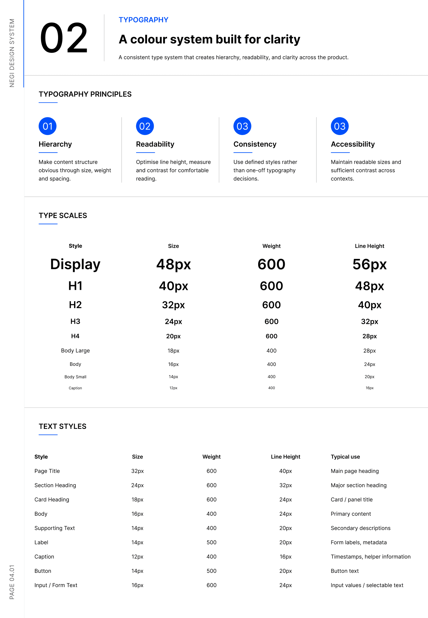
A single type scale, plus named text styles mapped to real UI moments — a heading component references "Section Heading", not "24px semibold".

Hierarchy

Make content structure obvious through size, weight and spacing.

Readability

Optimise line height, measure and contrast for comfortable reading.

Consistency

Use defined styles rather than one-off typography decisions.

Accessibility

Maintain readable sizes and sufficient contrast across contexts.

Page Title32px / 40px · 600 · Main page heading
Section Heading24px / 32px · 600 · Major section heading
Card Heading18px / 24px · 600 · Card / panel title
Body16px / 24px · 400 · Primary content
Supporting Text14px / 20px · 400 · Secondary descriptions
Label14px / 20px · 500 · Form labels, metadata
Caption12px / 16px · 400 · Timestamps, helper information
Button14px / 20px · 500 · Button text
Input / Form Text16px / 24px · 600 · Input values / selectable text
06

Foundations — Spacing

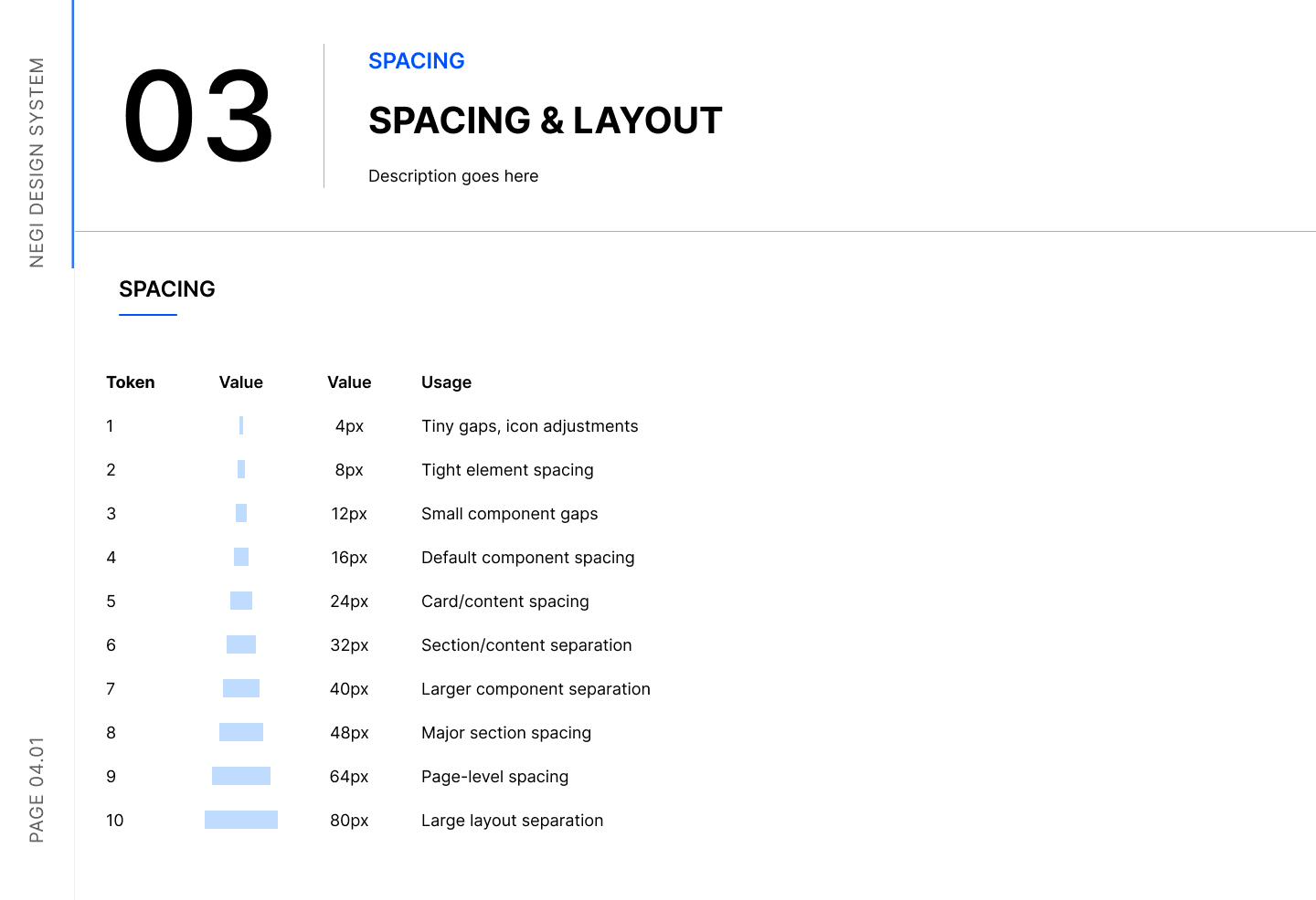
A 10-step scale, each value tied to a real layout decision rather than an arbitrary number.

014px
Tiny gaps, icon adjustments
028px
Tight element spacing
0312px
Small component gaps
0416px
Default component spacing
0524px
Card / content spacing
0632px
Section / content separation
0740px
Larger component separation
0848px
Major section spacing
0964px
Page-level spacing
1080px
Large layout separation
07

Primitive vs Semantic Tokens

A primitive is a raw value. A semantic token is what a component actually references — the name carries the intent, so the underlying value can change without touching a single component.

blue-600 · #2563EBcolor/action/primaryThe button colour a component reaches for, regardless of which blue it resolves to
neutral-900 · #0F172Acolor/foreground/defaultPrimary text colour, everywhere it appears
neutral-0 · #FFFFFFcolor/background/defaultThe base surface colour a screen sits on
green-600 · #16A34Acolor/feedback/successEvery success state, from a toast to a badge
neutral-200 · #E2E8F0color/border/defaultThe border colour used across cards, inputs and dividers

Use semantic colours in components. Don't use primitive colours directly in components — that's the one rule the whole token layer exists to enforce.

08

Components — Next Layer

Next layer

Not yet designed

The component library — buttons, inputs, cards, navigation — is the next layer to build on top of these foundations and tokens. Foundations first was a deliberate sequencing choice: a button built before the token layer existed would have to be rebuilt the moment the tokens changed underneath it.

09

System → Product

Tokens applied

The clearest proof the tokens work isn't a components page — it's applying them to a real interface end to end. The colour foundation page includes a light/dark example of the same screen, built using only semantic tokens — surface, foreground, action, border — with no component layer involved yet.

10

Outcome & What I Learned

The outcome so far is a foundation, not a finished product — real, working colour, typography and spacing tokens, documented and applied to at least one real interface, with the component layer deliberately not yet built. No adoption or usage numbers are claimed here, since nothing has been handed to another team to use yet.

The hardest part of a design system isn't the components — it's deciding what not to standardise yet

11

What I'd Evolve Next

The system is a foundation, not a finished product. The next stage of maturity:

Building out the component library — buttons, inputs, cards, navigation — on top of the existing tokens

Accessibility auditing of the colour and type foundations against WCAG contrast requirements

Documentation depth — usage guidelines and do/don't examples for every token and future component

A developer handoff format — exporting tokens in a form code can consume directly

A versioning and governance model for how the system changes over time

An adoption path for applying the system to future product work

Foundations, in Figma

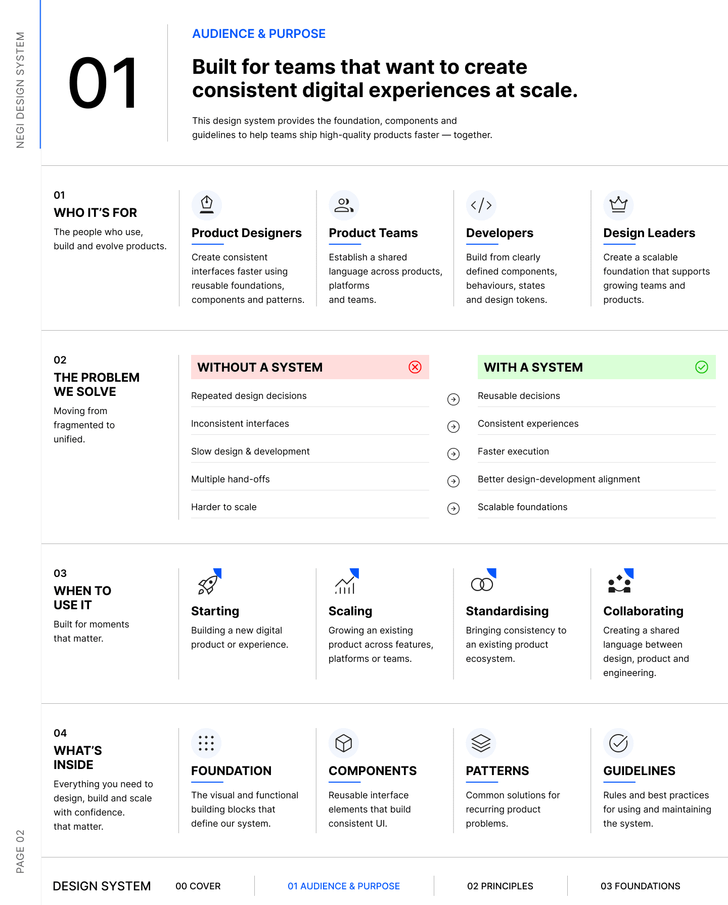
Design system overview page showing audience, the problem it solves, when to use it, and what's insideOverview
Design system colour foundations page — primitive ramps, semantic tokens and a light/dark theme exampleColour
Design system typography foundations page — the type scale and named text stylesTypography
Design system spacing foundations page — the 10-step spacing scaleSpacing

Have a similar project in mind?

Let's talk about what you're building and how I can help you ship it.

Next case study

AdvancePay